by Jakob F. Dittmar
Summary
This paper discusses comics for the blind, based on the example of the tactile comic life by Philipp Meyer and Astérix par Touchtatis ! by Olivier Poncer. It looks into the potential and the restrictions of sequential pictorial storytelling that is accessible to blind readers. Special attention is given to the elements of comics narratives and the technical background of tactile text and image representation. Due to the process of giving information in tactile comics, these present an extreme challenge for readers who have been born blind, while readers who have become blind later in life seem to be able to refer the elements of spatially dispersed tactile information representing the visual appearance of environments (images) to their memory of visual information.
Let’s look at a simple story, told in a highly symbolising manner: a dot grows in size, another dot appears, they circle each other and get closer, then they overlap. A third dot appears and grows between them before migrating out of the picture. One dot fades and vanishes, the other remains for a few frames before it fades and vanishes, too. The title of this comic consists of only one word: life (see fig. 1 for the story and fig. 2 for the style the comic has been produced in). This leads the reader to interpret the images as stages in a story about life. And suddenly the sequence of images containing those little dots becomes quite profound.
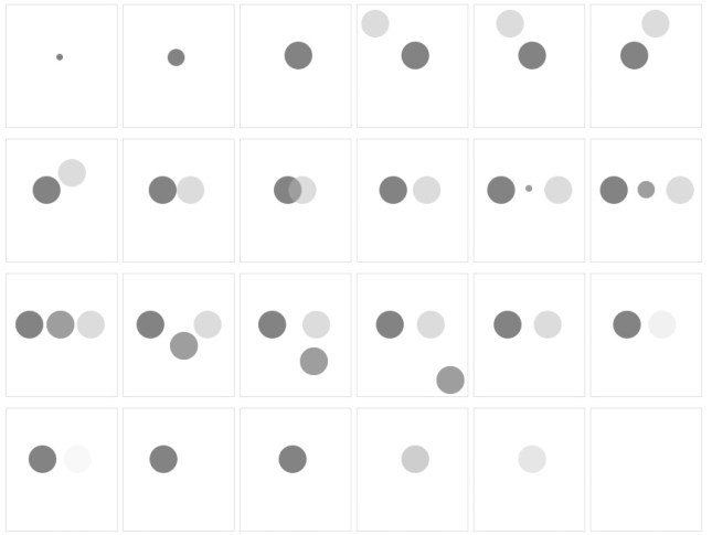
Fig. 1: The story of life by Philipp Meyer, here depicted on one page in grey tones. The comic is put onto the paper in braille embossing, showing four images per page. (Illustration: Meyer 2013)
The example is important in an altogether different way, too. The able-sighted see an arty design comic devoid of any drawn lines, text bubbles, colour or decorative detail that they are used to in comics. It is not printed on the paper but embossed into it—not because of some design manifest oriented stylishness, but because the story is supposed to be read with the fingertips. It is not designed to be read with your eyes and therefore does not resort to colours: the intended readers are blind or severely visually impaired and would not be able to perceive nuanced use of colours or standard printing. In due consequence, the different elements of the comic are embossed in slightly different height, the filled and the half-filled circles feature a lowering of dots towards its middle to make them more appealing to touch. While reading the different images, the reader learns the logic of sequential pictures and applies it to the decoding of the medium and its story. At the end of the story the circles fade over the course of several images into the surface of the paper. According to the test readers, this is understood as a narrative device that is detailing changes in the same object but not as representations of different circles (Meyer 2013).
When I wrote a first reflection on Meyer’s comic, I was much more optimistic about the potential of tactile comics (see Dittmar 2014). Lord (2016) gives an interesting testimony to reading more into that paper than due. To clarify, the comic referred to was produced in 2013 by Meyer in a comics course at Malmö University that I happened to teach. He had no previous experience with written communication for the blind, did not know anyone blind, nor did he have a background in comics generally but he did have a lot of knowledge and abilities in interaction design. In his development of the comic, he was supported by nota, the National Library for the Visually Impaired, Copenhagen. There he met blind readers who were willing to discuss and test his ideas and prototypes. The final work was also embossed at nota. After extended discussions on reading tactile images and texts, and doing more research together with Rainer F. V. Witte, the former head of the print and publishing division of blista (the Institution for the Blind at Marburg, Germany), I today understand the potential for tactile comics to be rather more restricted than argued earlier. Other tactile comics that have been developed since then support this point (see Lord 2016, 85-120).
Crucial from a comics development perspective is the fact that life did not simply transfer visual information into some kind of embossed or relief printing. It is not the standard content of comics that gets transferred into another technique of production. It is not reproducing the silhouettes or forms of people and elements of whatever environments as tactile information, but has managed to use a different pictorial language for the storytelling. In preparatory interviews with experienced blind readers, Meyer was told in no uncertain terms that blind people would not be interested in such a literature: it would fail to represent the world in a way that was referring to their reality. As a result of these contacts that introduced him to the existence of a different non-visual reality, he adapted the concept of comics and developed a completely new type of literature for the blind, narrating in sequential images consisting of symbolic forms—all constructed from embossed dots, which are the smallest possible unit of pictorial information in writing for the blind (see Fig. 2 for details in tactile variation within the comic’s images).
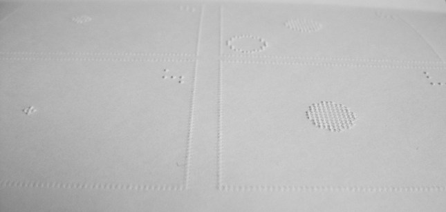
Fig. 2: Meyer’s life in its final form, detailing the layout’s style of pages and individual images. (Photo: Dittmar 2014)
Comics’ Characteristics and Blind Readers
Comics scholars all know the various definitions of comics that are built around the central point of comics being visual literature, with a focus on the visibility of all information taken from or based on diverse visual codes. In comics content is offered in written text and images that are designed to be read by the individual readers on their own (see for instance McCloud 1993; Carrier 2000; etc.). Ian Hague (2014) has discussed these restricted perspectives on comics in depth. But imagine being blind: what appeal does visual information offer? Imagine someone who has always been blind—all experience of the world always came via senses other than sight. The consequence is a different reality from the standard comic readers’ experience.
Existing comics are hardly accessible to blind people. These have been turned into audio books for quite some time—or even fully dramatized audio plays like the plays based on comics that are marketed as “audio films” by, for example audiocomicscompany—but comics stop being comics and become like all other recorded readings of literature in the process.
One of the very few comics that had been intended specifically for blind people previous to Meyer’s work is Astérix par Touchtatis ! by Olivier Poncer (1988), produced for and published by a publisher specialised in picture books and similar items for blind readers. A version with braille text on top of the text printed in black was even produced, so that blind readers might be able to read the comic on their own. Also, in a separate, monochrome book, blind readers were introduced to the shapes used in the images so that they could develop an understanding of the references made in individual shapes. These versions seem to be extremely rare, while the version that uses text that is printed in black in combination with embossed images can be found rather easily. The latter version does not enable blind readers to read it on their own, just like all other examples predating Meyer’s comic that have been found so far. Instead, it can only be read with the assistance of a sighted person, as text is given in flat print—not in braille or otherwise embossed—and thus remains undetectable for the blind reader. Fig. 3 may serve as an example: while the helmets, spear, fist, and contour of France are embossed onto the paper, the text, its frame, the extralinguistic signs and action lines are all printed flat on the surface of the page. The colouring of the embossed objects is aimed at the sighted reader, as it is rather pointless for the blind.
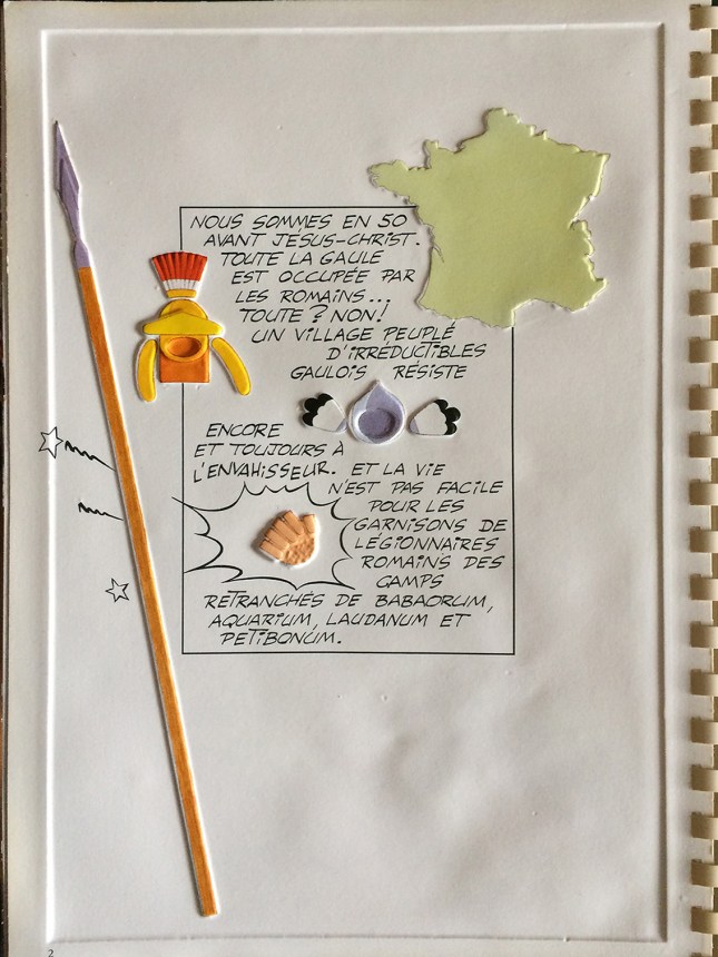
Fig. 3: The introductory text of Astérix par Touchtatis ! by Olivier Poncer (Illustration: Olivier Poncer, Chardon bleu Éditions – Laurence Olivier Four – 1988 © Les Éditions Albert René – Goscinny Uderzo – 1988)
Of course, the immediate personal contact with pictorial information is not translatable, as the intake of visual information does not even follow some prescript line, but for sighted readers, the eye jumps between the many aspects of the page and the individual images while the mind makes sense of all information gathered by putting it into chronological and narrative order (Pollack and Spence 1968; Hochberg 1978). In comics, visual information is offered simultaneously for the reader to sequence, interrelate and make sense of the work on their own. When turned into audio literature for example, the comic is turned into acoustic information that sets the sequence of description. The listener has to follow the narration for there is no other way; it is not possible to verbally offer to the reader several pictorial aspects simultaneously.
In this paper, I am concerned with a different approach. To be true to the nature of comics as graphic literature, these have to allow for autonomous individual reading by the (blind) reader. Reading comics is an immediate and personal occupation of each reader with the chosen reading material (Carrier 2000, 65). While this personal reading of sequential pictures and the construction of interrelations between the images and texts is characteristic of comics, no specific style of drawing is needed, nor is the use of written text nor speech balloons mandatory.
Established Reading for the Blind
All reading of new forms of narration builds upon previous experiences of reading. This applies to comics for blind people as well. Comics for the blind build on the established forms of literature for the blind: blind reading is done with the fingertips of both hands placed alongside each other—here, too, the physical sequence of signs on the paper is crucial for the process of reading.
For text, braille writing is the established type that is embossed onto a surface. Typographic variations of braille exist, but only to a very limited extent as national or international codes set limits to variation: “For braille to be read by a blind person, the dots of each cell must be easily discernible by touch and the height of the dots must be sufficient to be easily distinguished from the background.” (BANA, n.d.)
Slight differences of individual distances between the individual dots and signs exist, but as all have to be tactile to the fingertips, the options for different type styles are very limited (see Tobin 1989a). For resolution or density of points, the underlying grid for braille production equals approximately 20 DPI (Fig. 2 and Fig. 6). In comparison, printed matter is produced with a resolution ranging from approximately 170 to most usually 300 DPI. The difference explains the limitations for variation and detail in braille. In theory, different tools for applying, embossing or piercing dots result in tactile difference. How far these can be used for the implicit expression of emotions or narrative atmosphere is completely unknown. The logic of the code depends on the regularity of its single space characters, each taking the same space on the paper, all based on a six dot grid. Due to these formal conditions, texts take up quite a lot of room, as type cannot be set very small (AFB 2019). As a consequence, braille books generally are spiral bound large-sized volumes (27 x 34 cm), produced from rather thick paper or carton (at least 120 g/m2) (see dbsv 2019; bana n.d.). Graphic material is partly thermo-formed from thin plastic sheet material, picture books for the blind are often produced this way (s. Tobin 1989b, 68 f.). Thermo-formed plastic pages as well as braille paper pages become unreadable if pressed together much as their embossed content gets flattened out.
Keep in mind that any description of reality for blind people builds on their distinct experiences of their environment and all meaningful information about it. Depictions of houses or cityscapes do not show the world from a perspective that is relevant for people born blind, as it never could be experienced visually. Also, for people that became blind or heavily impaired visually later in life, other aspects of reality become much more important and relatable—the aesthetic values ascribed to specific perspectives and pictorial traditions are firmly based on the visual experience of the world. Take a blunt example: a view towards the steeples of Bruges in the distance through the glittering of light in the hot air over the summery fields of Flanders may be considered beautiful by a sighted person, but cannot be met by a comparable experience by a blind person. Indeed, it is impossible to experience the landscape in the same way, even though an educated blind person recognises the cultural meaning of the described scene and even though the intensity of the sun, the warmth of the air, and the environmental sounds in the situation itself are fully accessible to blind and visually impaired people as well. An artistic representation of the situation would have to work accordingly if it was to be accessible in a non-visual manner.
This issue is in fact comparable to the meaninglessness of sound words for deaf people: transcriptions of sounds are partly pointless, as these references are not met by an experience of sound qualities. Sound-object associations are learned but mostly remain theoretical (Schafer, Plunkett, Harris 1999). Things might make a “fffffft” sound rather silently or much louder, but the written sound does not refer to experiences of specific sounds by deaf people, for whom distinct sounds remain vibrations experienced by the body but not connectable to specific audio qualities like each sound’s rhythm, pitch, volume, intensity or duration. It is quite difficult to describe for example a penetrating sound in its difference from other obnoxious sounds (Pidge 2013). To the deaf reader “ffffffft” could be “sssssssssst”—the differences in sharpness or the representation of the resonance of specific objects while emitting sounds are not referring to the reality of the deaf. For a deaf person it is a matter of learned knowledge to know that the onomatopoeia “tick tick” refers to a small clock or watch while “tock tock” represents the darker and deeper sound of a large clock. This knowledge is usually not supported by detailed own experiences of the represented resounding of differently sized objects (Stark, Ansel, Bond 1988). The same principle applies to a reality that is based on the experience of blind readers: some aspects remain meaningless, as there are no distinct properties applied to their differentiated forms. The reality of the blind reader is built on their own experiences and these are partly difficult to understand by those who can see. But then again—and without wanting to promote unlimited constructivism—all world views and realities are subjective to groups and individuals as they depend on distinct experiences and their interpretation of the real world. Accordingly, non-abstract images are much more difficult to present to blind readers, as they represent a world view that is different from that of the readers. The translation of the images’ content into tactile information reduces the options for shadings, depiction of distances in the background, and so on—depending on the scene shown, a picture description can refer to abstract information only, it can be intellectually understood, but not filled with recognition as is possible for sighted viewers or readers (for details on image representation for the blind, see AEB 2005; for an example of Edward Hopper’s painting Nighthawks transferred to embossed representation, see artagogo 2001). Accordingly, the reduction of details is the central feature of all communication of images to blind people. The same applies to images in comics.
In consequence, direct experience of pictures is best possible where these images have three-dimensional features that can be felt: in children’s books, the shapes of objects usually are traced with embossed dots or lines (dots are not mandatory in the representation of images, of course) to introduce their shapes, the haptic qualities of the depicted object itself might be experienced, too, but related colours and hues remain abstract, for example. To fathom the different perspective, think for example of an elephant minus the colour grey and try to focus on its other qualities. Accordingly, works of art and other pictorial information are often represented in relief print that tries to relate the most important features of, for example, a historically important painting. The visual information is translated into three-dimensional tactile information and is accompanied by explanatory written or recorded text.
Comics as New Type of Reading Material for the Blind
Blind people have so far not been treated to a reading experience of comics: no routine exists for reading several pages that contain a sequence of frames with pictorial information in each of them. Narration in braille is established in text, not in images. But a new form of literature told in sequential images is built on reading experiences of the highly structured information given in braille code. From the experience of reading text sequences in braille, the concept of reading images in sequence can be understood.
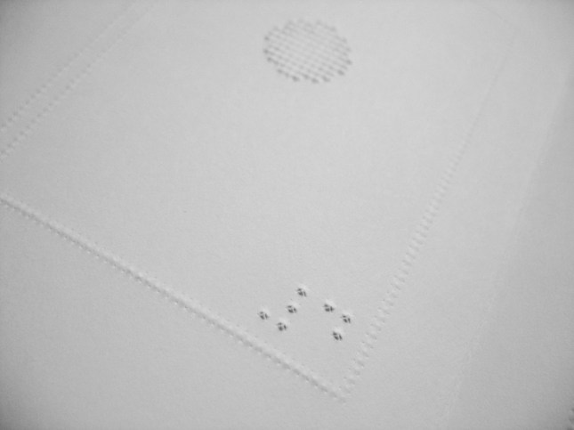
Fig. 4: Introducing the sequence of images: the numbering of the first four images of the comic in braille. (Photo: Dittmar 2014)
Each reader has to understand the logic of the comic form of narrative—the narrative sequence building on the one hand and its possible meanings on the other hand. It is a completely new concept in literature for blind people that frames mark individual units of a narration, with the narration not being carried out in explanatory text but in these units themselves. It is not sentences or paragraphs but frames around content that constitute narrative units. Each reader has to understand that the content of each unit refers to previous and following units and they have to be willing to decode the narrative that might be about something they have not been informed about yet, while all information on content is coded in symbolic forms and is dependent on their personal interpretation. Again, a comparison with earlier experiments in comics for blind readers helps to understand the difficulty: in Astérix par Touchtatis ! by Poncer (Fig. 5), readers are introduced to the running gag of the constant punishment of the bard by the blacksmith. The text is only visible to sighted readers and does not help the blind reader to decode the story or its details, no information in black or colour is haptically discernible. The embossed forms and lines on the page are the only information provided to blind readers and while the faces of the figures within the story are abstracted into sequential depiction of facial details, the action depicted in the sequence of images on the page is reduced to only a few objects—omitting movement lines and meta-linguistic symbols like the stars indicating the pain of being hit on the head. For readers who do not know storytelling in sequences of images, the sequence of the three images is blurred by the placement of pictorial elements on top of the gutters, making them even more difficult to understand as divisions between states and moments in the progression of events. For readers new to comics storytelling, this sequence makes it extremely difficult to understand the underlying principle.

Fig. 5: One page from Astérix par Touchtatis ! by Poncer with elements placed across the gutters between images. (Illustration: Olivier Poncer, Chardon bleu Éditions – Laurence Olivier Four – 1988 © Les Éditions Albert René – Goscinny Uderzo – 1988)
The Potential of Comics in a Nutshell
The logic of sequence building is stripped to its core by the examples: there is a sequence of states in which a set of drastically reduced forms is depicted. If the comic is not managing to introduce and separate all its elements in a clear way, the sequence of events is not understandable. In Meyer’s comic, the different elements are embossed at slightly different heights, the filled and the half-filled circles feature a lowering of dots towards their middle to make them more appealing to touch (Fig. 6). While reading the different images, the reader learns the logic of this approach and applies it to the decoding of the medium and its story. These distinct shapes are changing form and fade from the page towards the end of the story. Thanks to the clarity of sequence and narration, this is easily understood as symbolic, but the process of fading gets its real drift from the title of the story. Immediately, the reference to the reader’s own life becomes clear.
The details of the comics show what is needed in a comic: there are the framed stages of the narration, relating with each other in their content. It is understood by readers that a time sequence is to be read into them. On the cover of his comic, Meyer gives an explanatory sentence, stating that the first four frames of the narration are numbered in braille to explain the intended sequence of reading (Fig. 4). That information is not needed if you have read a comic before, as you know and remember how to read those sequences of images. But for blind readers this is a first—there is no available previous experience of reading some story consisting of juxtaposed images beyond children’s books. As the example from Astérix illustrates, previous approaches to comics for blind readers have not enabled readers to re-construct the story from their sequences of images per page without help by sighted readers.

Fig. 6: In Meyer’s comic the filled and the half-filled circles feature a lowering of dots towards the middle to make them more appealing to touch. (Photo: Dittmar 2014)
No text is used in Meyer’s life at all but it still provides us with a detailed narrative, even carrying emotional address—most readers are touched by life’s inevitable conclusion. If text were added, it would allow for references to all kinds of abstract or concrete matters without changing the composition of the figures but due to the formal requirements on type, it would need comparatively a lot of space and would result in large images, if the text were to not dominate the image concerned.
One side effect of this new comics format is that it tells us a lot about the way comics narrate: the reader gets a gripping comics narration built from simple forms that are put in relation to each other.
Imagine a comic narration as a construction using elements that are placed on various superimposed structural layers—like transparent sheets that contain, for example, pictorial information on the placement of figures in whatever surrounding, or either sounds, thoughts, direct speech, or narrator’s comments (Dittmar 2011, 179-182). In Meyer’s life, only the pictorial base layer of comics content has been used. The other layers remain empty: no sounds, thoughts, speech or narrator’s comments are provided. However, the comic still succeeds in telling its intricate story.
Aside from the title and an explanatory sentence on the cover, written text is omitted, leaving the narrative free from all language references, no text needs to be translated and fit into balloons, commentator’s boxes, or other texts. Each reader constructs the narrative from the sequence of the images only. Words are neither used as pictorial elements nor as references to any topic. The pictorial language is open to interpretation and invites the reader to reflect on the human condition, without resorting to pathos or kitsch. The pictorial language comes with cultural background, like all narrations do (see Hague 2014 for a thorough discussion of different frames from which to approach comics). Moreover, the narrative form builds on cultural knowledge: each element of the current picture needs to be compared to earlier or later pictures after putting into relation the elements of each image. Sighted readers of comics do this, too, but the eye reads much faster than fingertips do. The need to memorise the relation of pictorial details to each other in every image asks for a lot more effort and concentration on the part of blind readers than reading comics does of sighted readers. For those blind readers who have no recollection of visual qualities, each image presents a hide-and-seek experience in some representation of space that has to be related to some meaning in the first place.
While standard comics are not legible for blind people, comics for the blind like Meyer’s are accessible to seeing and blind readers alike, especially as no Braille writing has been used in the narration itself. It might appear simple in its way of narration, but it introduces the way comics work to a completely inexperienced readership. A very complex story would not be ideal for that purpose—imagine, to go for a stereotype once again, if the first comic you had ever read had been one of the advanced Chris Ware charts, would you have understood or would it more likely have ended your foray into new fields of literature?
To experienced comics readers, life appears very stylish in its very reduced visual form. It is not printed in black and white, but the whole comic is white on white as the story is embossed into the pages. For the seeing reader all visual information is dependent on the current lighting conditions creating shadows and lighted areas on each page. For somebody used to standard comics, this appears as quite artistic in its design, devoid of ornament, elegantly plain in its forms; a reduction of the narrative to its bare necessities. To the blind reader, there is no lack of colour or line work. Instead, life focuses on what it was intended to do: it introduces sequential storytelling in juxtaposed images that are to be read individually and have to be related to the previously read units of the same story. To the inexperienced comics reader that is quite a challenge and for readers who have been born blind, the challenge of deducting information from a sequence of framed units that present information in a non-linear way, is extreme.
Biography
Jakob Dittmar is senior lecturer in Visual Communication at Malmö University. His comics research combines approaches from Cultural Studies and Science of Art, mostly. His main interest in comics research is on how narrations are constructed and on representation. He was made Associate Professor for his research in comics and en-passant-media by the Institute of Technology, Berlin (TU Berlin) in 2008 and by Malmö University in 2014.
Works Cited
AEB. “About Art Education for the Blind.” Art Education for the Blind, 2005, http://www.artbeyondsight.org/sidebar/aboutaeb.shtml. Accessed 21 June 2019.
AFB. “Braille.” American Foundation for the Blind, 2019, http://www.afb.org/blindness-and-low-vision/braille. Accessed 21 June 2019.
artagogo. “Art for the Blind”. artagogo, 2001, http://www.artagogo.com/commentary/artforblind/artforblind.htm. Accessed 21 June 2019.
BANA. “Size and Spacing of Braille Characters”. Braille Authority of North America, n.d., http://www.brailleauthority.org/sizespacingofbraille/sizespacingofbraille.pdf. Accessed 21 June 2019.
Carrier, David. The Aesthetics of Comics. Pennsylvania State University Press, 2000.
dbsv. “Wie die Brailleschrift funktioniert.” Deutscher Blinden- und Sehbehindertenverband, 2019, http://www.dbsv.org/wie-die-brailleschrift-funktioniert.html. Accessed 21 June 2019.
Dittmar, Jakob F. Comic-Analyse. 2nd revised ed., Konstanz, UVK, 2011.
Hague, Ian. Comics and the Senses: A Multisensory Approach to Comics and Graphic Novels. New York, Routledge, 2014.
Hochberg, Julian. Perception. 2nd ed., Prentice Hall College Div., 1978.
Lord, Lacey. Comics: The (Not Only) Visual Medium. 2016. Massachusetts Institute of Technology, MSc Thesis, dspace.mit.edu/handle/1721.1/106761. Accessed 21 June 2019.
McCloud, Scott. Understanding Comics. Harper Collins, 1993.
Meyer, Philipp. life. 2013, http://www.hallo.pm/life/. Accessed 21 June 2019.
—. Tactile storytelling. 2013, http://www.hallo.pm/life/Life.pdf. Accessed 21 June 2019.
nota. “taktil tegneserier går verden rundt”. Nota (the Danish Library and Expertise Center for people with print disabilities), 25 June 2013, nota.dk/viden/taktiltegneserie-g%C3%A5r-verden-rundt. Accessed 21 June 2019.
Peterson, Mary A., Barbara Gilliam, and H. A. Sedgwick editors. In the Mind’s Eye: Julian Hochberg on the Perception of Pictures, Films, and the World. New York, Oxford University Press, 2007.
Pidge (anonymous). “Environmental Sound.” Environmental Sound | Deaflinguist’s Blog 2013, deaflinguist.wordpress.com/environmental-sound/. Accessed 21 June 2019.
Pollack, Irwin, and David Spence. “Subjective Pictorial Information and Visual Search.” Perception and Psychophysics, vol. 3, no. 1, 1968, pp. 41–44.
Poncer, Olivier. Astérix par Touchtatis! Caen, Chardon Bleu Editions / Laurence Olivier Four, 1988.
Schafer, Graham, Kim Plunkett, and Paul L. Harris. “What’s in a Name? Lexical Knowledge Drives Infants’ Visual Preference in the Absence of Referential Point.” Developmental Science, vol. 2, no. 2, 1999, pp. 187-194, doi.org/10.1111/1467-7687.00067. Accessed 21 June 2019.
Stark, R. E., B. M. Ansel, and J. Bond. “Are Prelinguistic Abilities Predictive of Learning Disability? A Follow-Up Study.” Preschool Prevention of Reading Failure, edited by R. L. Masland and M. W Masland, York Press, 1988, pp. 3-18.
Stinson, Liz. “A Simple and Beautiful Comic for the Blind.” WIRED, 6 Nov. 2013, http://www.wired.com/design/2013/06/a-simple-and-beautiful-comic-for-the-blind/. Accessed 21 June 2019.
Thoma, Street. “An Art History & Art Making Course for Blind Adults at the Philadelphia Museum of Art.” Disability Studies Quarterly, vol. 33, no. 3, 2013, dsq-sds.org/article/view/3740/3275. Accessed 21 June 2019.
Tobin, M. J. “Braille Character Dimensions.” Witte, pp. 64-66.
—. “Size, Spacing, and Materials: Meeting the Needs of Braille Readers” Witte, pp. 67-79.
Witte, Rainer F. V., editor. Production Of Hardcopy Materials For The Blind. Marburg, Deutsche Blindenstudienanstalt, 1989.

Harriet Earle
2019/08/04 at 21:04
Hi Margareta,
Can you email the CFP to comicsforum.editorial@gmail.com.
Thanks,
Hattie
LikeLike