In her article ‘L’héritier des maîtres de l’aquarelle’, Emmanuelle Lequeux (2011) wrote that Hugo Pratt evoked the history of abstract art in his work Corto Maltese. And indeed, from the three-panel-detail she presented alongside her article one might get the impression that Pratt ventured into the abstract in his comics. However, it raises the questions of whether Pratt did stretch the medium’s boundaries to include abstraction into his narration or whether this is only due to the detail she chose and if comic panels can actually be analyzed without taking at least the scene as a whole into account.[1]
Corto Maltese was bursting with innovations when its first story ‘Ballad of the Salt Sea’ appeared in installments in 1967. Firstly, it was astonishing in its clear design and unusual length of 165 pages. The multitude and complexity of its characters, the morally dubious anti-heroes, the landscape that itself became an active character in the narration as well as the extensive research Pratt conducted for his stories were groundbreaking. And without a doubt ‘The Ballad of the Salt Sea’ already shows tendencies to reduce the pictorial content to a minimum, something that went on to be considered typical of Pratt’s work.[2] In an interview conducted in the early 1970s, he stated: ‘Vorrei arrivare a dire tutto con una linea’ (Trevisani 2010) – I want to arrive at telling everything with one line. At that time his style was changing significantly, moving away from his Milton Caniff inspired chiaroscuro and becoming increasingly clean, reduced and daringly simplified in its language.
This reduction he was aiming at often took the form of a very particular shift in perspective that Pratt used as opening sequence in his stories: he zoomed in on his subject to such an extent that it was no longer possible to recognize it. Instead, it appeared abstract as the picture’s motif was concealed by the extreme close-up. In a second step, however, Pratt slowly zoomed out again, panel by panel enlarging the section shown, until finally in the last picture the motif was fully revealed. The first time he experiments with this is in the story ‘Leopardi’ (1973) which starts with a white panel shot through with thick black lines (fig. 1). The caption refers to the war in Africa in 1918 which does not seem to have any connection to the drawing. In the third panel, one can identify hind-legs and a tail and the fifth panel reveals the black lines to be the stripes of a grazing zebra. As the first page has seven panels, it is not much a surprise that the black lines turn out to be a zebra skin – after all the reader perceives the page as a whole before reading each single panel. The same applies to the opening of the 1985 story ‘Tango’ that in its original black and white version starts with several round and oval shapes colliding in the opening panels. The last panel of the same page shows these shapes to be billiard balls in extreme close-up.
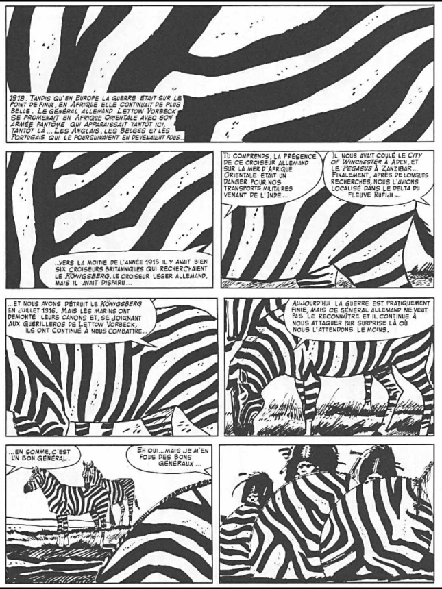
Fig. 1 – © Cong SA, Switzerland. http://www.hugopratt.com. All rights reserved.
Pratt uses this technique as an exposition, as a slow introduction into the time and place of a new adventure. This allows him to set the atmosphere by emphasizing sound and movement. This helps the reader to tune in to the story and is comparable to an overture on music. It cannot, however, be seen as abstract as the “solution” is always given on the same page and is embedded into a narrative frame that gives precise meaning to it but is of no consequence for the rest of the story.
This becomes clear in the one example where Pratt erased the pictorial content near the very end of a story: ‘Le elvetiche’ (1987) contains three completely black panels on page 85, two of which contain speech balloons (fig. 2). Emmanuelle Lequeux compares this sequence to the concept of the passing of time in the conceptual work of On Kawara by saying that the black panel followed by Corto’s statement ‘That was a long time ago’ would stretch time.[3] However, she ignores the fact that these panels are embedded in a narrative frame which show Corto in a conversation with Sandman, thus on the verge of falling asleep. The dissolution of the pictorial context is therefore easy to interpret for anyone who is familiar with reading comics. Her claim that the empty black panel signifies the passing of time referenced in the last panel’s speech balloon is difficult to retrace. Scott McCloud demonstrated in Understanding Comics that simply repeating a panel is enough to show the passing of time.[4] So if nothing happens, time appears to be stretched, which is exactly what happens in ‘Le elvetiche’, regardless of the dissolution of the pictorial context.
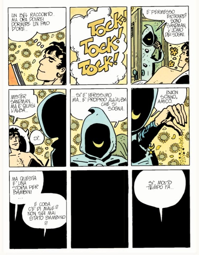
Fig.2 – © Cong SA, Switzerland. http://www.hugopratt.com. All rights reserved.
This means that for Hugo Pratt the dissolution of the pictorial content is primarily a way of exploring the possibilities of the comics medium. It has an experimental air of playfulness to it. On the one side, the reduction is embedded in a narrative frame which makes it easy to be deciphered, while on the other hand it does not yet have a narrative consequence for the story as a whole and is thus not an integral part of it.
Lorenzo Mattotti takes this idea one step further. He dissolves the pictorial content but never offers a clear solution. Instead, he narrates through a color code, thus establishing color as an independent language. The first time he used color in this way was in his comic Il Signore Spartaco (1982), though here it was employed to give structure and coherence to the associatively linked subplots. Color highlighted recurrent themes and thus helped the reader to identify the meaning of the complex narrative structure. It is in his masterpiece Fires (1986) that Mattotti presents a fleshed out version of his technique. Instead of giving different characters the same color to demonstrate that they are corresponding to each other in different narrations, he dissolves the pictorial content altogether and tells primarily through color.
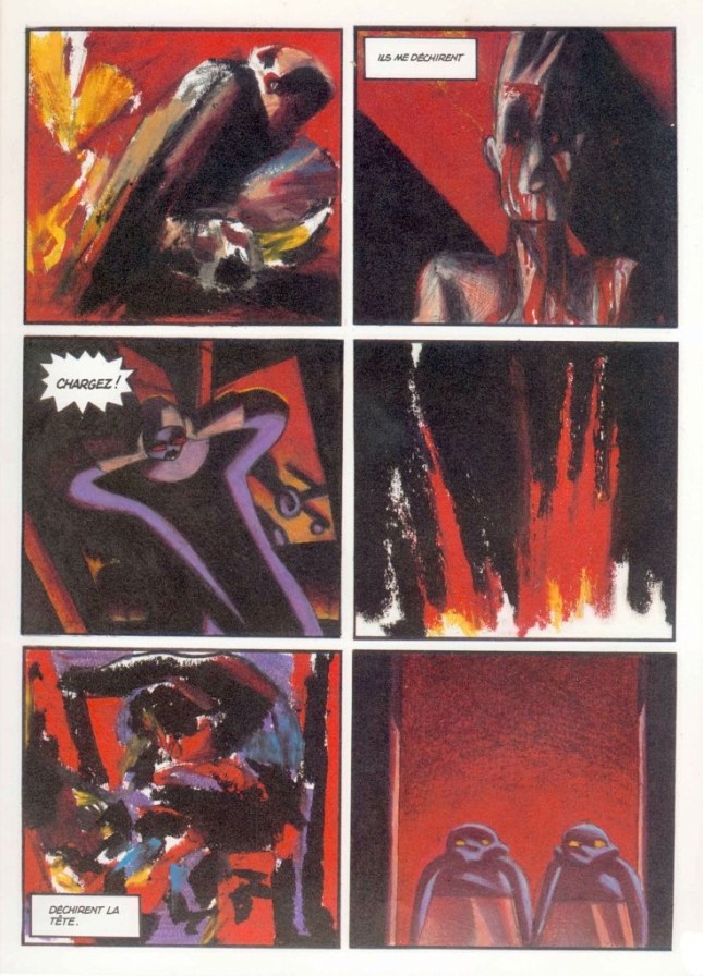
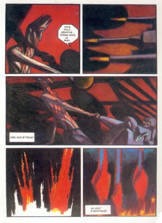
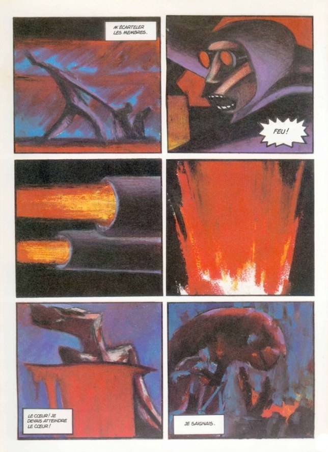
Fires tells of a colonial clash between the warship Anselm II – which can also be seen as a metaphor for civilization – and nature which takes on the shape of an island inhabited by strange, wild and therefore intimidating beings. The soldier Absinthe strangely connects with these beings and starts questioning his mission. From the very beginning the ship is characterized by cold and despite its military supremacy pale grayish colors while the island is associated with a strong red-yellow, an intense sea-blue and pitch black – colors that first appear in the story after Absinthe’s first encounter with these creatures and which represent also his changed perception and identity. It is noteworthy that the drink “Absinthe” is also called the “fée verte”, the green fairy. So both in name and in color, he is closer to the island than to the other soldiers. At the very end, the ship starts bombing the island and this scene can only be fully understood if the colors are taken into account. Fig. 3 consists of six panels with juxtaposed content: three panels show the different parties (Absinthe, the soldiers, the creatures), the other three panels might show explosions. The one in the middle shows without question the explosion on the island because there is no blue in it which would represent the island. The other two panels, however, are different: above all, they are non-figurative, showing only the sheer force of destruction in the chaotic arrangement of colors. It captures the effect that the destruction of the island has on Absinthe. This becomes clear because there are traces of blue, yellow, red and black in all panels. Through these colors, the whole narration is turned around. Up to this point it seemed as if Absinthe himself had chosen to protect the island – now it seems as if the island had possessed him and forced him to turn against his mates on the ship. It is not the ship’s fire in the fourth panel of fig. 4 or fig. 5 but the blue-tinged fire of the island that kills him, each explosion tearing him further apart.
In his paintings, Mattotti tries to find out how much the pictorial content of a panel can be reduced without emptying it of its meaning. It is through color that even his non-figurative drawings maintain their narrative function within the story. Despite a formal rapprochement to abstract art, the dissolution of the pictorial content in Mattotti’s work only partially defies narration: firstly, because narration is only replaced by another form of expression, namely color, and secondly, because the individual abstract panels are embedded in the comic’s sequential context. By doing so, Mattotti establishes color as an independent narrative element so that the use of the colors in an otherwise abstract panel is enough to sustain the narrative. Compared to Pratt, his abstract panels are also embedded within a narrative frame but they stay ambiguous – no clear solution as to how to interpret them is offered. They also lose their playfulness as they become an integral part of the story as a whole which would lose its meaning if the abstract panels had been cut out while Pratt’s narrative would still work even without the abstract panels.
Works cited:
Lequeux, Emmanuelle. 2011. “L’héritier Des Maîtres de L’aquarelle.” In Le Voyage Imaginaire d’Hugo Pratt, 28–33. Paris: Beaux Art éditions.
McCloud, Scott. 1994. Understanding Comics: The Invisible Art. New York.
Trevisani, Alessandro. 2010. “Il Marinaio Gentiluomo Che Ha Attraversato La Storia. Amico Di Rasputin, Dall’ Oceania All’ Argentina Senza Concedersi l’ Amore.” Corriere Della Serra, June 30. http://archiviostorico.corriere.it/2010/giugno/30/marinaio_gentiluomo_che_attraversato_storia_co_9_100630062.shtml.
Barbara Uhlig studied protohistoric archaeology and art history at the Universities of Munich and Eichstaett (Germany). She is writing her dissertation on the work of Lorenzo Mattotti and published articles on Guerrilla Gardening, early illustrated editions of Alice in Wonderland and, of course, Mattotti. Her main research interests lie in subversive art, text-image-relationships, and the development of Italian comics since the 1960s.
[1] – In the 1970s abstract comics that defied a classic narrative and stayed enigmatic in both their visual and narrative content were of course nothing new. Abstract panels within a rather classical adventure story as in Pratt’s, however, were quite rare.
[2] – Pratt’s growing stylistic simplification becomes highly noteable in ‘Corte sconta detta arcana’ (1974) and fully broke through in ‘Favola di Venezia’ (1976).
[3] – ‘Difficile de savoir si Pratt connaissait l’oeuvre de On Kawara, mais il a révolutionné la bande dessinée par l’aspect épuré qu’il donne à certaines cases. L’espace y devient le temps…’ (Lequeux 2011, 32) In fact, the whole story told in ‘Le elvetiche’ can be seen as a reference to the logic of dreams where in the blink of an eye, hours seem to pass. In this sense the passage described by Lequeux actually described that practically no time at all passed by linking the Sandman’s knocking to the very real knocking on Corto’s door that is depicted on the following page. Thus, the passing of time functions very differently from Lequeux’ interpretation and is independent of the dissolution of the panels’ pictorial content.
[4] – (McCloud 1994, 100)

2 responses to “The dissolution of the pictorial content in Hugo Pratt’s ‘Corto Maltese’ and Lorenzo Mattotti’s ‘Fires’ by Barbara Uhlig”